Expedia Search Form Widget
Product design, web and mobile, B2B and B2C

Final Design - Live example from partner https://www.bradsdeals.com/travel


Breakpoints specifications
Final Design - Live example from partner https://www.bradsdeals.com/travel
Expedia adds value and increases traffic to travel sites, bloggers, and influencers by offering the responsive Search Form Widget to partners. It also includes the Generator Tool, where users can customize their own widget. They easily generate a code, copy and paste this code into their site, and done! Very quickly their site offers access to the Expedia inventory for all line of business.
The Problem
This widget was live for a couple years, and we heard from users that it needed to be more flexible and customizable to match their site's brand, colors and style. The widget was not responsive, offered very limited fixed size options. and had only 7 background images to choose from.
The Solution
I was brought in as the solo designer for the Global Partner Solutions team, and I worked with the team's Product Manager and Engineers on solutioning of the enhancements, redesigning the Search Form widget, and the self-serve generator tool. The main goal was to make the widget responsive to resize according to the site i-frame container. However, based on historical usage data and user feedback, I decided that we should continue to include the pre-defined size in pixels, since it was valuable and useful in certain user scenarios. I hand-picked and added 8 extra images as options for the background, and I also added an option to use a solid color - a simple addition for extra customization power to the user. When validating the designs with users, I also learned that the lack of infant field was a blocker for some users to adopt this widget. Consequently, we added this new field, resulting in more sites adopting the Search Widget, leading to more bookings and increase in revenue for our partnership organization.
Expedia Citi Card Landing Page
B2C, landing page, ads, web and mobile


With the objective to increase credit card applications, in 2018 I collaborated with Product Manager, Account Managers, the Expedia.com rewards and brand teams, and developers, to redesign the landing page and relaunch of the Expedia Citi Credit Card partnership campaign at Expedia.com.
The Problem
The landing page and banner ads shown at Expedia.com were a few years old and the number of card applications were way below expected.
The Solution
As part of the relaunch campaign, I redesigned the landing page, and the banner ads found throughout the Expedia.com shopping experience.
During the research phase, I analyzed the current user experience from beginning to end and identified gaps and improvements needed for the customer journey. I also analyzed competitors landing pages and points calculator tools, identified content hierarchy and best practices on the current market landscape. In my designs, I also utilized some performance data points from the partner's other credit cards, with information on what resulted better credit card adoption in the past.
Please open the Campaign Solution pdf above to view final designs.
The biggest challenge with this project was working closely with the Expedia checkout team, to make sure the ads we were updating in the checkout experience did not impact the shopping experience and revenue. The two teams worked closely to apply an A/B test for the ads, which confirmed that it did not compromise revenue, while still increasing number of engagements for the credit card partnership.
Also, with our user tests, we learned that the most valuable feature incorporated into the new landing page was the points calculator, since calculating points and understanding the Expedia Rewards tiers were the main users pain points. I worked closely with the Expedia.com rewards, brand, and Merchandise (Ads) team so our page and ads followed the new rewards rebranding look and feel that was happening at that time. After some design reviews with stakeholders across all the teams, I validated the designs so the final solution is responsive, accessible, consistent with UI Tool Kit/Expedia Rewards design, and compliant with the hard legal requirements from the partner. This page and ads were live from 2019 to 2021.
Results and impact
After launch we saw an increase of click-through and engagement with ads throughout the expedia.com and landing page. The number of credit card applications also increased by 12% within the first month.
Customizable site header and footer templates for our internal on-boarding tool
Product design
The problem
A standard white-label multi-line of business partner site created using our on-boarding tool takes over 8 weeks to launch, and one of the factors for this long implementation is the custom development of headers and footers for each new partner's site. Our team's goal was to increase our organization scalability and reduce time to launch by automating several implementation steps within the tool itself.
The Solution
The idea was to add pre-designed and customizable Header and Footer Templates in the tool that can be set up by non-dev users, which would reduce time to launch from 8 to 6 weeks.
Step 1: Research/Explorations
This tool was a couple years old and developed without any designer support, so I was brought in to design the UX and UI of this new feature, which meant I was constrained of using the same components/look and feel in order to maintain consistency within the tool.
I started by identifying the user personas, understanding their needs and pain points. In summary, the Account and Implementation Managers, which are not code savvy, wanted to self-serve and be able to setup a partner site without support from the development team. Based on user interview, and data analysis of current partner sites, I identified the most common, desirable patterns and designs for headers and footers. I analyzed all partners site custom requests during the solutioning phase, potential partners designs in the pipeline, competitors and designs from partners in similar market segments.
Step 2: Solutioning/Requirements
After defining the most saleable and flexible designs, I gathered requirements from engineering, business, legal and implementation managers on which features should be customizable. I also identified feature gaps in the tool, like the need for a logo or image upload, which was necessary to provide best experience and long-term value for the app. I influenced the team to add this new feature to the scope of the project.
Step 3: Design
I created the user flow for this new feature, wireframe and prototype for all breakpoints for the following solutions:
-
3 headers
-
2 footers
-
Configuration screens
-
Asset Uploader
-
Status Dashboard
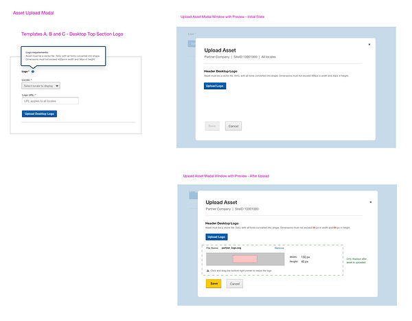
Mockup of the Asset Upload modal
In order to offer a more user friendly experience, I added to the scope the development of a preview panel with the ability to proportionally scale the logo.
Results
The addition of header and footer templates allowed for the implementation manager quickly offer some out-of-box design options for partners, with a great adoption rate from most new partnerships. In average, it resulted in a reduction of a new partner site implementation time by 10-15%.

Citibanamex-Expedia
Program Page Design
B2C, landing page, web and mobile
Is this Case Study I explain how my landing page design came to life, the process, how I applied content hierarchy, and how my solution solved user and business needs - it also created a new standard to our business offer, added value that benefited multiple users. My design was based on data, design expertise, methodology, focusing on improving booking results.
Impact: this design showed great results and became a standard (template) for future partnership sites.