Healthcare Data Solutions in Microsoft Fabric
UX design lead - H2 2023


How can I unify and standardize data for analytics to drive business value and better patient care?
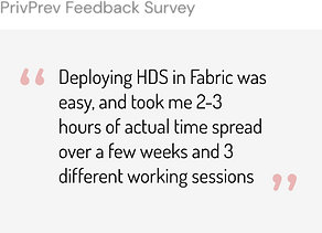
On October 10 2023, Microsoft announced the private preview release of Healthcare Data Solutions in Fabric during the HLTH conference held in Las Vegas, presented by Alysa Tailor, the Corporate Vice President from Azure & Industry. The release brought significant media coverage and excitement. We secured nearly 30 large enterprise customers to participate in the private preview.

But why does it matter?
1- Strategy alignment
Microsoft makes big bet in healthcare
Microsoft is making a substantial investment in the healthcare space, consolidating scattered teams and products into a new organization with the aim of doubling or even tripling current revenue. Our team at Microsoft Cloud for Healthcare is contributing to this goal by addressing one of the most significant challenges for our customers: large data management.

2- Customer problem
70% of users* have challenges performing data integration, transformation and unification tasks within the complex healthcare landscape.
Enterprises with years of growing data in silos are looking for unification and adhering to industry standards. Transforming data for research and patient care takes months; so providing time savings is a significant opportunity.
* respondents of an internal survey
3- The project
My leading role navigating ambiguity in a very complex team structure
In July/2023 I was hired by the Microsoft Cloud for Industry (MCI) Design team, to lead UX on the healthcare stream of this project, At time my role was ambiguous but still very collaborative, and required that I ensured alignment between stakeholders from Retail and Sustainability, while I worked closely with PMs, content designers, researchers, and engineers within the healthcare team. I ensured that all industries were aligned on the design solutions in order to achieve a cohesive experience, while seeking reviews and approval from the Fabric design team regarding standards and guidelines from the platform.

Project goals and strategy
From an end-user (customer) perspective, the goal was to:
-
Offer a unified and simplified SaaS experience that accelerates customer data and AI journey
-
Offer an easy discovery and deployment experience
-
Enable consolidation, transformation and analysis of data within a Lakehouse platform
-
Accelerate time to value and increase efficiency on data transformation
From an leadership (business) perspective, the goal was to:
-
Launch within MS Fabric Platform to increase adoption
-
Contribute to the Microsoft triple play strategy, bringing together our key platforms (M365, Fabric, and Azure) to amplify offerings and revenue.
Success metric
For the private preview, the success metric was to launch a native Fabric experience by Oct 10th, allowing it to be announced during the HLTH conference event.
How our solution gives time back to users on their data transformation workflow
I created this graphic to help users understand the value of our solution, explaining how our capability pipelines enable data unification, transformation and analytics following the medallion architecture standard, moving data between lakehouses efficiently, giving time back to users. I led brainstorming sections with stakeholders and PMs to create this visual aid, which has been used on internal vision videos, product documentation, and external marketing blogs.

Project challenges
Here are some challenges I faced in this project, and how I solved them:

1- Leadership push: 3 teams alignment with aggressive timeline
After the MCI team received the project green light, the leadership changed the delivery date from November to October to align with marketing plans, reducing development time by a month.
2- I was a new hire: Leading healthcare design while still onboarding
Upon my hiring, our industry teams were still learning about Fabric, a complex application that was still in private preview.
I quickly ramped up by focusing on project related resources first during my onboarding. I drove close collaboration with stakeholders, set expectations, and communicated my needs in order to deliver my designs in just over a month. Colleagues were very impressed with my ability to make well-informed decisions by the third week.
3- New process: requirements not aligned with LT/PMs, and communication discrepancies between stakeholders
With the new process and tight deadlines, designs had to start before finalizing requirements, leading to communication challenges and inconsistencies.
To address this, I broke tasks into smaller segments, proactively sought information from stakeholders, overcommunicated priorities during our all industry meetings, and focused on well-defined tasks first.
4- Fabric approval resource became a bottleneck
When faced with design approval delays, I proactively sought alternative validation methods, engaged with other Fabric designers for guidance.
IMPACT: I brought up to the Fabric design team new use cases that highlights potential platform-level improvements needed, such as a more flexible toast component and notification guidelines. The team verbally expressed positive feedback on my efforts to improve the platform experience.
4- The design process
Discover and define (research)
As part of the design process, I analyzed existing research materials from our UX research team to understand project goals and business strategy, for example answering the question “What does it mean for industry to show up in Fabric?”, aiming for a cohesive data solution experience in Fabric across all three industries.
I've identified our personas: Interoperability specialist, admins, and data analysts, scientists, and engineers. I've gained insights into our user journeys, learned about pain points, jobs-to-be-done (JTBD: deploy, ingest, transform, analyze - AI, and visualize), and opportunities. This understanding has deepened my empathy for our users. For instance, consolidating healthcare customers' data transformation solutions into one platform (from Azure Synapse, Solution Center) would enhance value, efficiency and solve for this well-known challenge for our customers.

User persona - MS confirdential

Touchpoint analysis - Click to enlarge.
I adhered to one of the Fabric principles: total flexibility for users. For example, during PM and UX discussions, I shared that we should allow users to be able to create multiple healthcare solutions in their workspace, even if it increased storage usage and costs.
In the absence of clear guidance from Fabric, I actively sought answers from the Fluent design system, aligning with the One Microsoft design philosophy.
Develop and deliver
Here are some examples of ideations I've developed for the capability details page, the capability tiles, and some icons. I created icons for our capability tiles, following the same visual style from the Fabric library, which allowed us to quickly deliver designs without having to go through the extent icon creation process from the Fabric team.

Designs were only considered final after an all industry UX review, which included Product, engineering, stakeholders, and design team members. Once approved, figma file was prepared for hand-off, and as part of the process, included accessibility markups.

I actively participated and influenced engineering approaches on finding the right solutions during UAT/bug bashes in order to ensure high quality of our product. I filed bugs in Azure DevOps (ADO) and supported the team as needed, including delivering quick designs for edge-cases that appeared during development.
Final design

Industry home. Click to enlarge (all images)

Details page

Landing page post-deployment

Landing page

Deployment flow with wizard

Manage page
5- Project outcomes
Built foundational experience that will scale
.
MVP for private preview launched on time
Oct 10th announcement
30+ customers
Reduced time to value
on unifying, transforming, and analyzing large data used on research and AI for better patient care

With this solution, we've successfully established a foundational experience that scales well as our offerings expand. The MVP experience was launched on time, delivering capability solutions that reduce data transformation tasks from months to days, accelerating access to data for research and AI to offer better patient care.
Learnings
Post-launch, we identified that our manual data sample deployment step is lengthy (about 1 hour), and don’t scale well as the number of customers onboarded increases.
I also started getting some customer insights regarding our deployment experience that helped me shape the features I was working on for public preview.
What's next
Next, I focused my design efforts on features that enhances the experience for the public preview release.
-
Update and delete capability
-
Self-serve sample data deployment experience
-
Comprehensive error handling and alerts
The goal was to continue close collaboration with the Fabric UX team.
-
Align to establish patterns
-
Understand new directions on the platform
-
Share research in this large and complex space
Additionally, my close collaboration with our UX researcher has influenced tasks and metrics for the validation UX research on the deploy, update, and delete flows. I built the prototype that supported the usability test sessions which provided great qualitative data on the experience. In the future, we are targeting to gather data on the following metrics:
-
NSAT (customer satisfaction)
-
MAU (monthly active users)
-
MAT (monthly active tenants)
6- Use cases
Going deep in how I execute and solve design problems
The problem:
My task was to design the capability deletion experience and its error handling flow. However, I quickly identified the following limitations in the platform's notification system:
-
Toast is not resizable or expandable
-
All toasts are persistent on the notification system
-
Only 2 lines of copy allowed
-
No detailed guidance on when/how to use it
-
Unsuitable for our use cases

To address this issue, I adopted the following principles and approach:
One Microsoft
(Fluent DS)
In the absence of Fabric guidelines, I utilized the Microsoft Fluent design system.
Consistent
Ensured my solution offered consistency across all industries, including deletion and deployment flows, with and without a wizard.
Don’t overwhelm user
Avoided overwhelming users with excessive toasts and alerts.
Alignment
with Fabric
Maintained alignment with Fabric, focusing specially on flexibility.
1- The process: discover/research
My process began with in-depth research, analyzing multiple libraries and guidelines (Fabric + Fluent + Azure). I documented the alerts flow for deletion and deployment experiences, obtaining an end-to-end view of the user journey. In my ecosystem comparison analysis, I examined other MS products, and collaborated closely with engineering and content designers to understand solutions and limitations on other notification patterns, resulting in various design options for displaying error details, for example.

MVP deployment and deletion flow. Click to enlarge.

Ideations: Error details side panel, message bar and expandable toast. Click to enlarge.
2- The solution and impact
My solution explored the use of toasts versus message bars, and achieved development time savings by:
-
repurposing an error details dialog pattern that I identified being used by other teams within Fabric
-
defining toasts for solution level alerts, and message bars for capabilities, while introducing inline status icons to help user understand progression better
Given the platform-level nature of this challenge, I validated my design by presenting it to the Fabric team during their wall review meeting, receiving helpful guidance and approval for my proposal. I communicated and shared the approved solution to all industry stakeholders, outlining changes to the deployment error handling and deletion flow for a unified user experience. This experience has also been validated via a moderated usability test which confirmed its effectiveness amongst participants.


Error details dialog and inline status icons.
Click to enlarge.
Impact:
The Fabric team comprehended the issue, valued the insights on new use cases I brought, and recognized how this enhancement would benefit all platform users.
Use case 1 - Alerts and Notifications
Use case 2 - Self-serve sample data deployment
The problem:
-
Current manual sample data deployment step is 40-50% (~1h) of the full onboarding process
-
Not scalable (large number of onboardings)
Goal:
Reduce sample data deployment time by 80%
to reach time to value faster
Constraints:
-
2 weeks for design (1 sprint dev time)
-
Use Fabric patterns for faster development
The process:
-
Fabric comparable analysis
-
Ideation with existing and new patterns
-
Validate development feasibility
-
Short-term versus long-term solution

The solution:
I decided to present a long-term and short-term solution on how the user would initiate the sample data deployment flow, since I wanted to lay down the foundation for the ideal user experience.
My long-term solution solved two user problems:
1) ability to deploy sample data and
2) improve capabilities discoverability and understanding.
Grouping tiles based on jobs-to-be-done was already on the roadmap for the common pattern team (all industries) as part of the GA release, and I identified that it would also benefit the sample data discoverability use case, helping users' mental model on where tasks belong within their data transformation journey.
Short-term solution: The approved design among stakeholders was re-purposing the current capability deployment experience since it would allow for fast delivery. I chose a different card type in the Fabric library for sample data in order to offer visual differentiation, while still incorporating a common sample data icon into the design to bring familiarity and reduce cognitive load on users that work across Fabric applications. During the UX review I’ve clearly communicated the risks of the short-term design and helped stakeholders to identify existing gaps regarding its implementation. The designs were delivered on time.
Sample data tile ideations. Click to enlarge.
Results:
This feature is expected to reduce the sample data deployment time by 83% (from 60 to 10min).
